


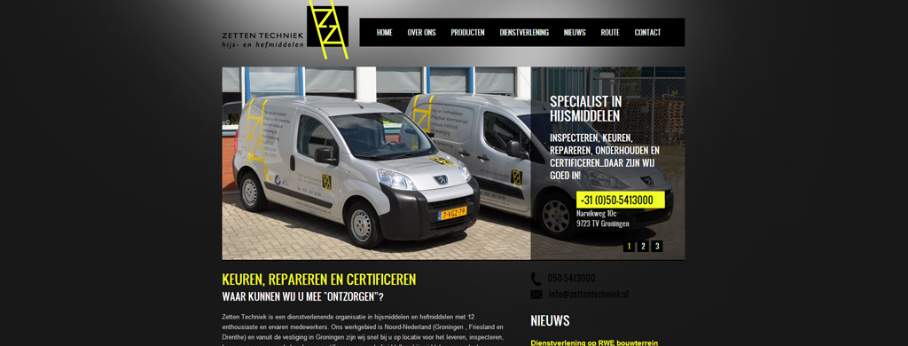
One could think of many domains making use of hoisting cranes and lifting materials. What about for example big construction sites where hoisting cranes are used to hoist heavy materials or within the energy domain where hoisting cranes are crucial to lift gigantic wind turbines. These are only two of the various domains that rely on hoisting cranes on a daily basis. Within all of these domains security is the main priority. Zetten Techniek is a company mainly active in the northern part of the Netherlands which relies on the latest technological innovations in order to offer all clients a maximum security combined with sharp prices and a super-fast service. As a company being focused on a perfect service delivery, they also needed a website which complied with the latest web standards and innovations.
A new website
The company’s old website urgently needed a refresh. Because Zetten Techniek had noticed many of their clients had replaced their standard desktop with a brand new tablet or smartphone to visit their website, they were looking for a new website which would be optimized for tablets and smartphones so each of their visitors would have a proper website display. Because nowadays various tablets and smartphones are on the market and because all of these tablets and smartphones have a different screen resolution, the company opted to go for a fluid responsive version which would contain the known breaking points, but which would also ensure a proper display for all non-standard resolutions by making use of width percentages, the ‘fluid’ part in the fluid responsive process. Relying on a fluid responsive process for the new website we made sure it can deal with the ravages of time and it will comply with all new tablets and smartphones which might be launched the coming years.
Elements with a width percentage
As soon as the website’s designs were ready and we had received the PSD files, we discussed all the different website elements with the client to ensure the overall functionality was clear and there would be no discussions or disagreements afterwards. As soon as everything was clear, our developer could kick off the PSD to HTML conversion which would of course also contain the required javascripts/jquery. After only a few days our developer had completed his project part and to make sure everything was spic-and-span and functioning as agreed (after all it remains a human process), we requested a second developer to take another look to make sure we hadn’t missed a required functionality. Upon delivering the designs as requested and upon making the whole project W3C valid, we requested the client to take a final review. When the client was fully-satisfied, we sent the files to the client, after which he could implement his custom-made and programmed CMS. The client was really satisfied with the end-result, which on its turn made us of course a satisfied company.
