


Currently major part of the new websites are delivered fully responsive which means a separate website display has been created for desktops, tablets, laptops and smartphones. These different website display formats ensure each website visitor will experience a different website display which has been optimized to match his/her screen resolution used to consult the website. This way a user consulting your website via a smartphone will be shown a completely different website display compared to persons visiting your website via a normal desktop. This way of working is also known as responsive, whereby not only HTML5 is used to a certain extent but whereby mainly the various media-queries which are offered by CSS3 are part of the deal.
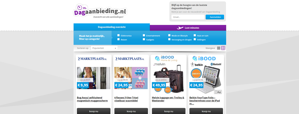
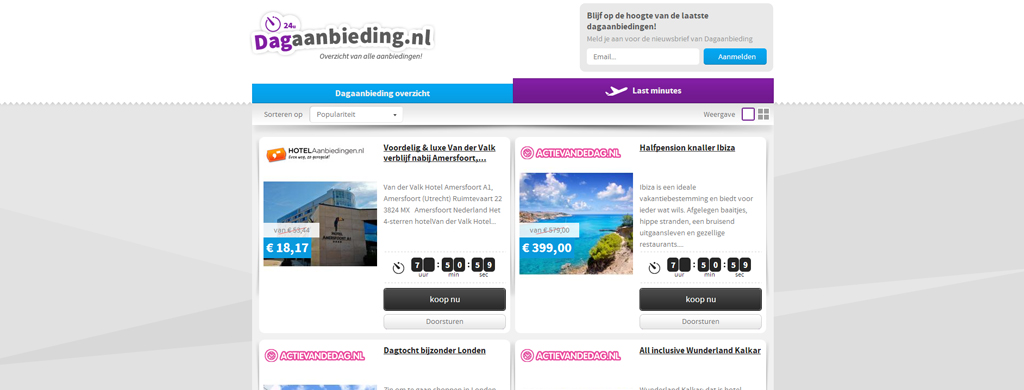
Various offers, various displays
The new dagaanbieding.nl website had been designed in order to be displayed not only differently according to the different screen formats but also in order to be even able to adjust the display per screen format. Having dealt with a similar website in the past we knew such a website couldn’t be realized by means of a PSD to responsive HTML process. Therefore we opted for javascript to detect the screen resolution and to automatically link it to the corresponding display format. This way the system was still able to structure and arrange the different formats. In fact the whole project wasn’t a real PSD to responsive process, but rather a standard PSD to HTML process because no media-queries were used. Nevertheless, the project somehow still could be called psd to responsive because we had to design the various pages for all different display formats.
The PSD to Responsive process
Upon aligning and discussing the project with the client and upon agreeing about the progress we were ready to kick off the PSD to HTML conversion. Because the project consisted of a large number of pages our developer spent quite some time on the actual conversion. Nevertheless he still managed to deliver the project within the agreed due ate and after some thorough testing we allowed the client to provide his feedback. It took about 10 minutes to deal with the client’s feedback which resulted into a very satisfied client. His programmer could now use our HTML as a basis to process all feeds and our client could start focusing on attracting new visitors and clients.
